
Mastering Nuxtjs Color Modes: A Step-by-Step Guide to Implement Dark Mode and Light Mode on Your Nuxt 3 Website


In this day and age, providing a personalized and engaging user experience is essential for businesses. One of the simplest ways to do this is to provide website visitors with the ability to choose between a light and dark mode. With the help of the @nuxtjs/colormode module, mastering color modes on your website can be achieved with ease. Nuxtjs is a popular Vue.js framework that makes it easier to create web apps and websites. In this article, we’ll discuss how to use the @nuxtjs/colormode module with TailwindCss to implement dark and light modes on your website. We’ll go over the basic concepts of color modes, how to add them to your website, and tips to ensure a smooth user experience. With a few simple steps, you’ll be able to take your website to the next level and offer your visitors an improved experience.
What is Nuxtjs and how does it help with color modes?
Nuxt is a popular framework for building scalable and production-ready websites and applications with Vue.js. The core functionality of Nuxt is its “built-in” module system. Nuxt's modules make it easier for developers to extend the functionality of the framework and integrate external libraries into their projects. With its variety of over 100 modules, Nuxt helps to simplify the process of creating great experiences for website visitors. One of the modules that can help with creating great experiences is @nuxtjs/colormode. The module makes it easy to implement dark and light modes on your website.
Getting started
To install the @nuxtjs/colormode module, you first need to install the Nuxt framework. You can install Nuxt by running the following command in your terminal:
npx nuxi init nuxt-colormode
Once you have installed Nuxt 3, navigate into your project and install the dependencies by running the following command in your terminal:
cd nuxt-colormode && yarn install
Installing TailwindCss
To install TailwindCss in our project, we are going to install the @nuxtjs/tailwindcss module. Run the following command in your terminal to install TailwindCss:
yarn add @nuxtjs/tailwindcss
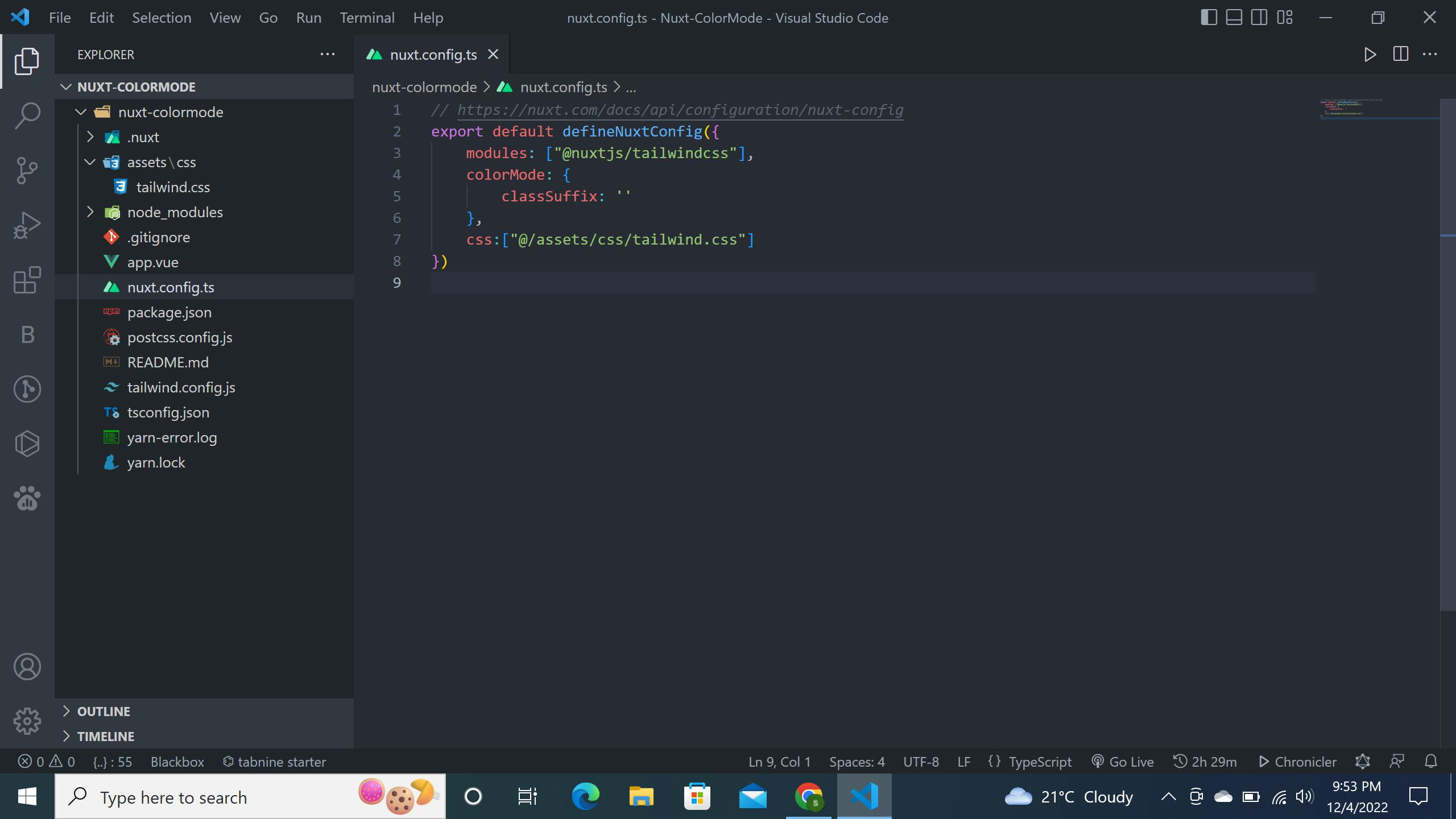
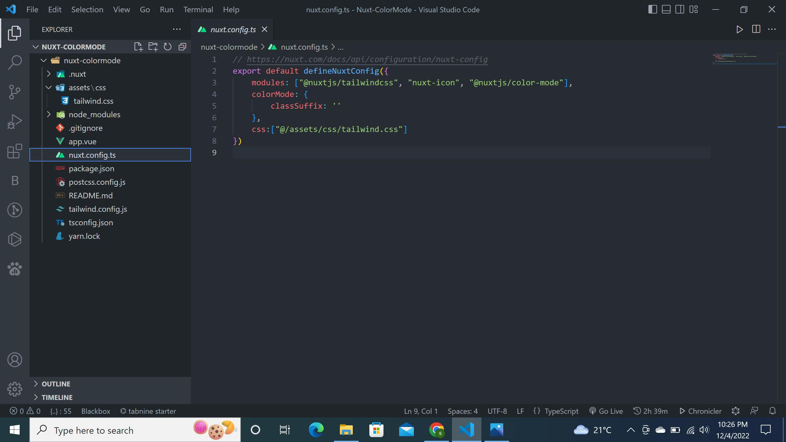
After installing the TailwindCss module, head over to nuxt.config.ts file and set the classSuffix option to an empty string and register your css path and also register the module as shown below:
After registering the TailwindCss module, open your terminal and run the following command to generate the tailwind.config.js file:
npx tailwindcss init -p
Configuring TailwindCss
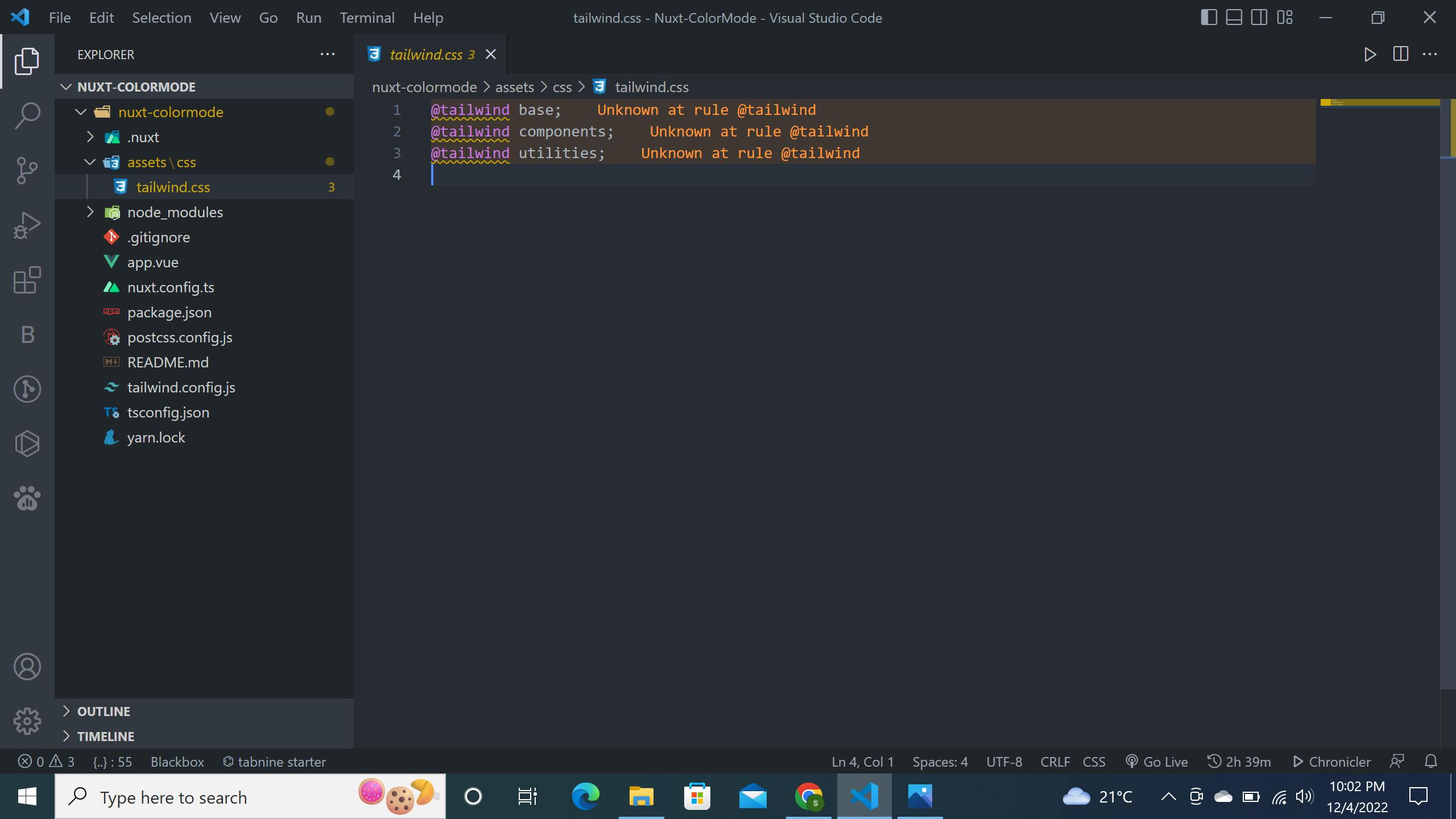
Create an assets folder at the root of your project and then navigate into your assets folder and create a css folder and inside it create a tailwind.css file. In your tailwind.css file add the following TailwindCss directives:
@tailwind base;
@tailwind components;
@tailwind utilities;
This is what your project structure should look like:
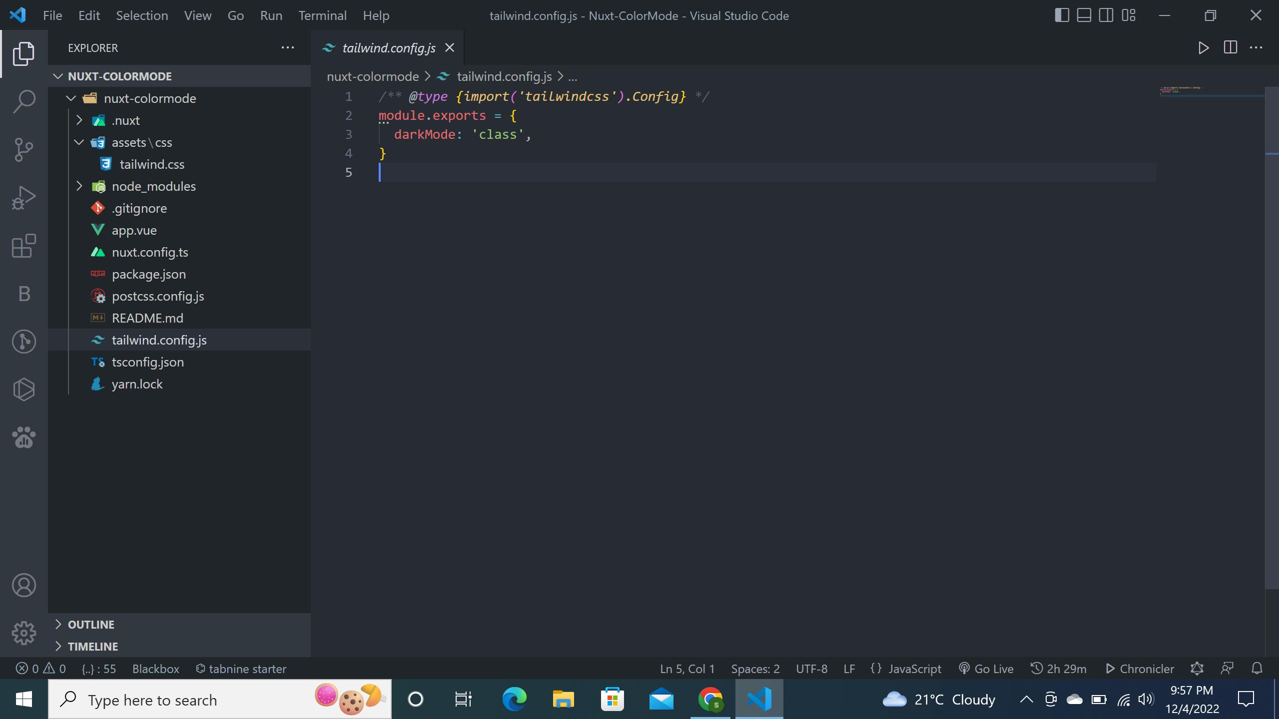
Head over to your tailwind.config.js file, and add the darkMode class as shown below:
Installing the nuxt-icon module
We are going to be using the nuxt-icon module to be able to display the sun and moon icons. To install the nuxt-icon module, run the following command in your terminal:
yarn add nuxt-icon
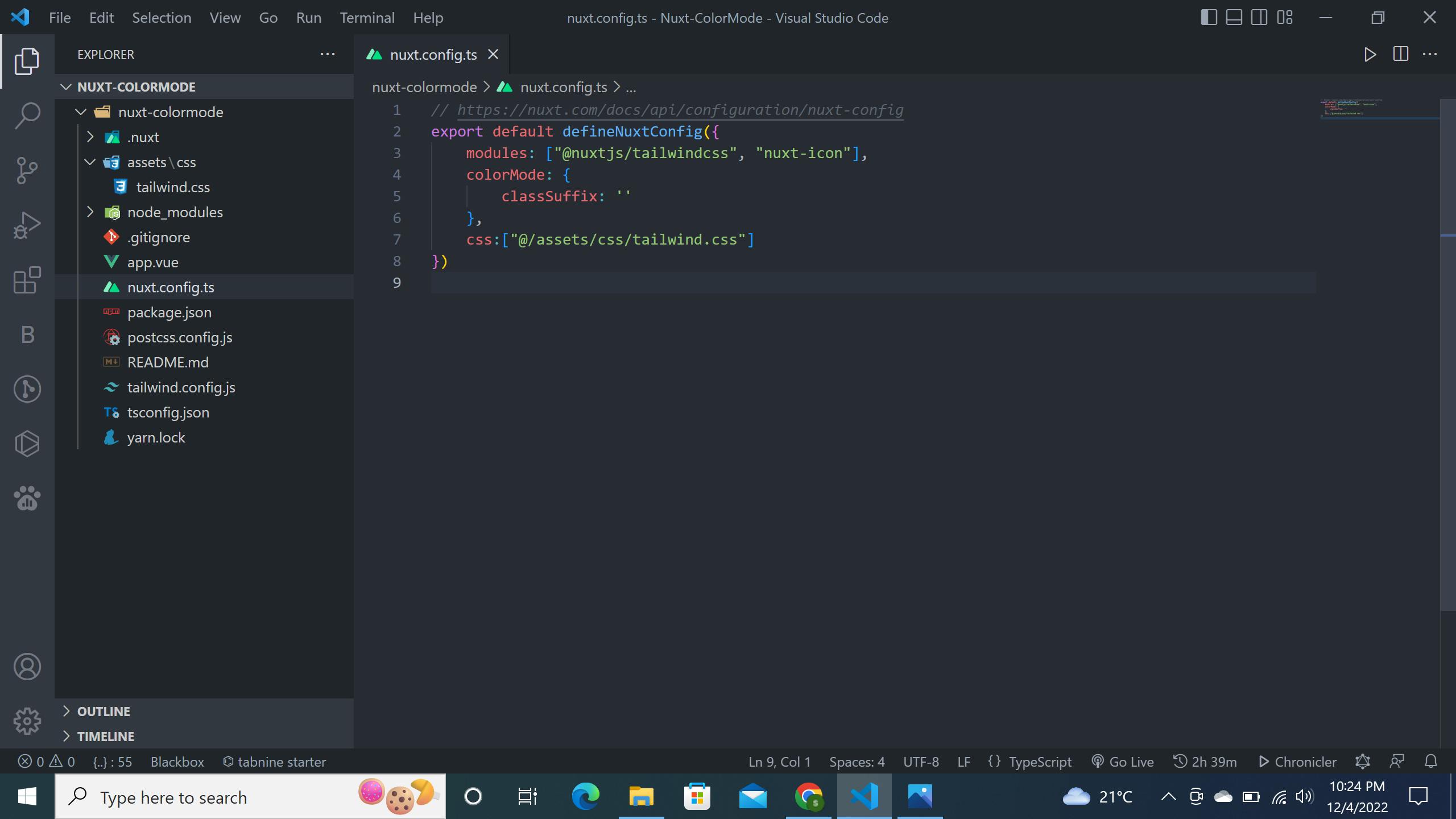
After installing the module, head over to nuxt.config.ts file and register the module as shown below:
Installing the @nuxtjs/colormode module
Finally, we are going to install the @nuxtjs/colormode by running the following command in the terminal:
yarn add --dev @nuxtjs/color-mode
After installing the module, head over to nuxt.config.ts and register the @nuxtjs/colormode module as shown below:
Setting up your dark and light themes
In your app.vue file, paste the following code:
<script setup lang="ts">
const colorMode = useColorMode();
const onClick = () => (colorMode.preference = (colorMode.value === 'light' ? 'dark' : 'light'))

</script>

<template>
  <main class="dark:bg-black bg-white grid place-items-center w-full min-h-screen">
    <button aria-label="Color Mode" class="flex items-center space-x-3 py-2 px-4 bg-gray-200 rounded-md"
      @click="onClick">
      <ColorScheme placeholder="...">
        <Icon v-if="colorMode.value === 'dark'" name="heroicons-outline:moon" class="text-xl" />
        <Icon v-else name="heroicons-outline:sun" class="text-xl" />
      </ColorScheme>
    </button>
  </main>
</template>
In the code above, we are using the useColorMode() composable to make a reactive color mode (dark / light / customs) with auto data persistence. We are passing useColorMode() to colorMode and then we are creating an onClick method that will trigger to dark or light mode when the user clicks on it.
In our template, we have a button tag that has an onClick event that contains two icons that interchange depending on the color mode state that the user has selected.
Tips for a successful color mode implementation
If you want to make sure your color mode implementation is successful, there are a few things you can do:
First, make sure that your website’s content is appealing and easy to understand. The content on your website should be helpful, engaging, and contextually relevant.
Second, you want to make sure that your website is accessible and easy to navigate, no matter which mode it’s in. You can do this by keeping navigation consistent across both modes, making sure your website loads quickly, and being mindful of color choice.
Finally, you want to make sure that your website is designed in a way that adapts to the color mode it’s in. This means that your website should be consistent across modes and have a similar look and feel. You can do this by keeping the same font and color palette, keeping the same layout, and making sure images and text are easily readable.
Conclusion
In this article, we explored how to use the @nuxtjs/colormode module to create a seamless user experience by integrating light and dark modes into our project. We also discussed how to create two themes for each mode, added a color mode button to our little project, and explored ways to optimize the user experience. With the help of the @nuxtjs/colormode module, you can easily integrate dark and light modes into your website, making it more engaging. The @nuxtjs/colormode module is one of my favorite Nuxt modules that I frequently use to integrate dark mode into my Nuxt websites.
Here is a link to the GitHub repository that contains all the code: https://github.com/selemondev/nuxt3-colormode-blog
Thank you for reading and happy coding!