


Table of contents
With the stable release of Nuxt 3 on the horizon, the Nuxt team has done an outstanding job of creating and maintaining the Nuxt modules' eco-system.
One of my favorite Nuxt modules by far is Nuxt Content. It allows me to easily write my blog posts in Markdown format and, better yet, add Vue components on to the page if and when I need to. Nuxt Content has a powerful feature that parses .md, .yml, .csv and .json files to create a powerful data layer for your application.
Here are some of the features offered by Nuxt Content :
File-based CMS
- By using Nuxt Content, you can write your content in Markdown, YAML, CSV and JSON and query it in your components.
Query Builder
- If you are experienced in MongoDB, I have some great news for you. You can now query your content with a MongoDB like API to fetch the right data at the right time.
MDC Syntax
- You can use Vue components to support props, slots, and nested components in your Markdown files.
Code Highlighting
- One of my favourite Nuxt Content features is
Code highlighting. It enables you to display beautiful code blocks on your website with theShikiintegration that supports VSCode themes.
Deploy Everywhere
- Nuxt Content supports both static and Node server hosting.
In this article, we are going to build a blog application with Nuxt Content. For this project, we are going to be using a CLI tool known as create tw. With this tool, we can quickly scaffold a TailwindCss project with our preferred JavaScript framework. The frameworks supported by the tool include Vue, React, Vanilla JavaScript, Preact, Solid, Svelte, Astro, NextJs, and NuxtJs.
Getting Started
- Before you get too excited, let's first create a new Nuxt 3 project with TailwindCss by running the following command in your terminal :
yarn create tw
During the installation process, you will be asked to give the name of your project ( nuxt-3-blog ) and then select your desired JavaScript framework ( Nuxt ).
After the dependencies have been installed, navigate into the project and run the following command in your terminal to open the project in your browser:
yarn dev
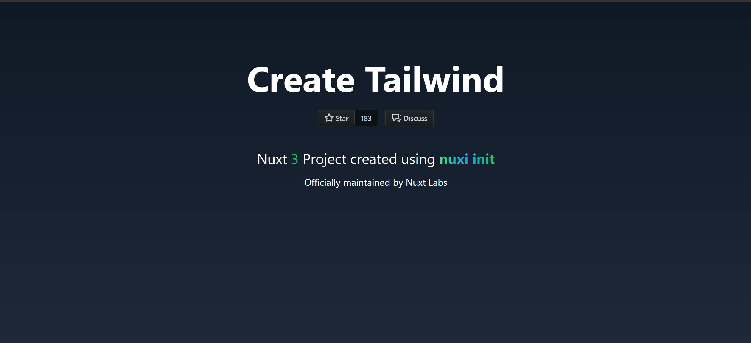
- Your new Nuxt 3 application will be served at
http://localhost:3000/. Here is what you should see:
Project Structure
- We will now tidy up the project's default structure in order to customize it to meet our needs. Here is how it should appear:
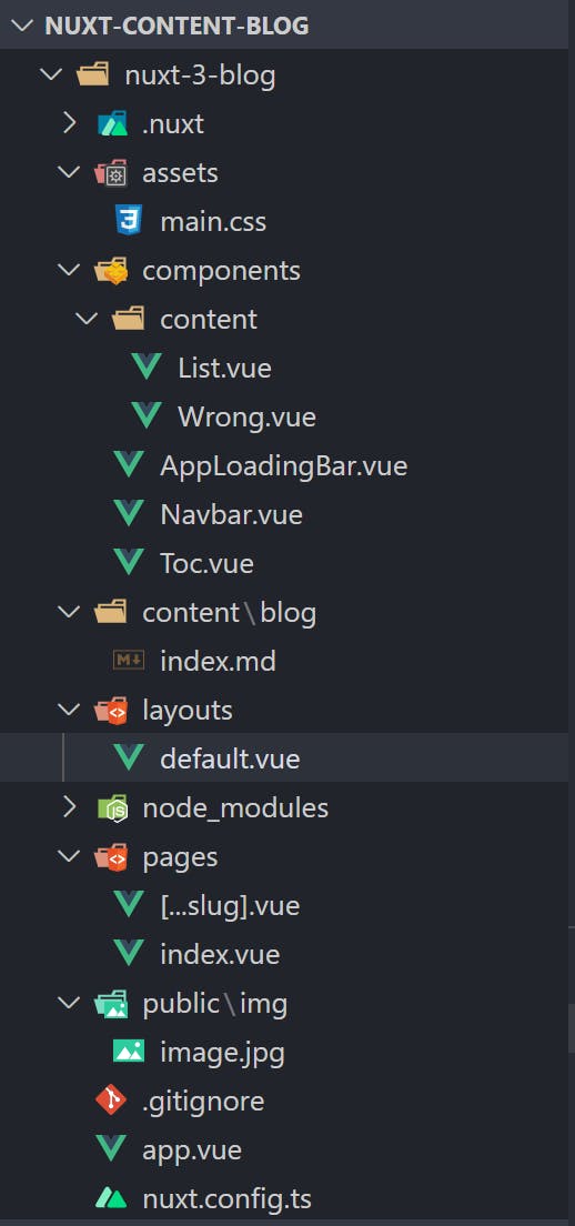
- My Github repository contains the image that we will be using. Don't worry, at the end of this article, I will include a link to my Github repository. Head over to your
main.cssfile and paste the following code:
@tailwind base;
@tailwind components;
@tailwind utilities;

@layer base {
    body {
        @apply bg-[#151515] text-white
    }
}

@layer components {
    .grid-layout {
        @apply grid place-items-center
    }

    .flex-between {
        @apply flex justify-between items-center
    }

    .flex-layout {
        @apply flex justify-between items-center px-4
    }

    .flex-center {
        @apply flex items-center
    }
}
To make our project vibrant, we are going to be installing some plugins.
Run the following commands in your terminal :
npm install --save-dev @nuxt/content
npm install -D @tailwindcss/typography
npm install @tailwindcss/line-clamp
- The uses cases for the installed plugins are listed below:
Nuxt Content
- A plugin for Nuxt that enables your application to ingest Markdown, YAML, CSV and JSON files into your application.
TailwindCss / typography
- A plugin that provides a set of prose classes to add beautiful typographical defaults to any vanilla HTML you don't control, like HTML rendered from Markdown, or pulled from a CMS.
TailwindCss / line-clamp
A plugin that provides utilities for visually truncating a text after a fixed number of lines.
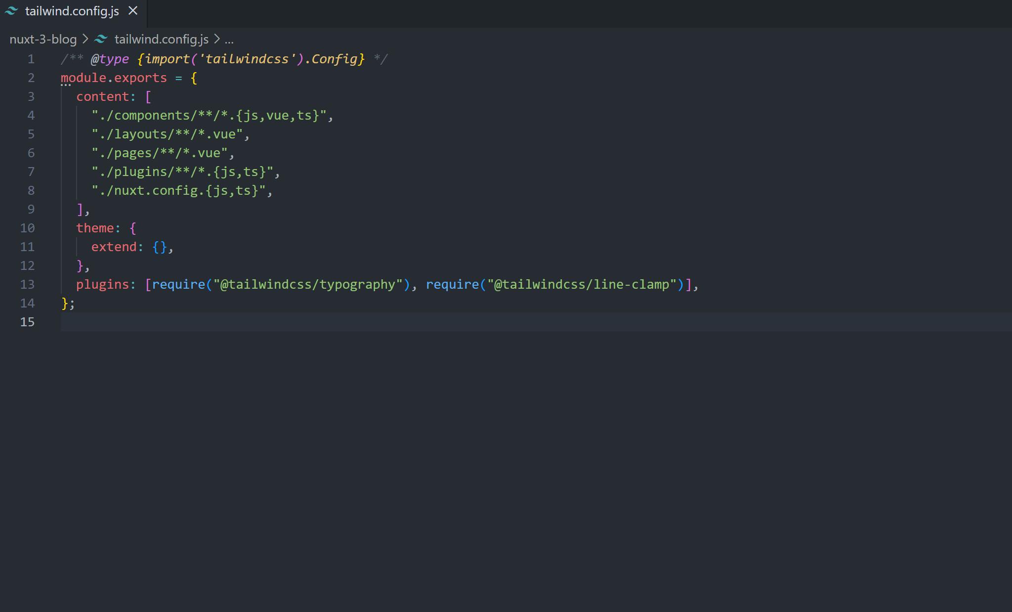
Navigate to your
tailwind.config.jsfile after the plugins have been installed and add the@tailwindcss/typographyand@tailwindcss/line-clampplugins in the plugins array. This is how yourtailwind.config.jsfile should look like:
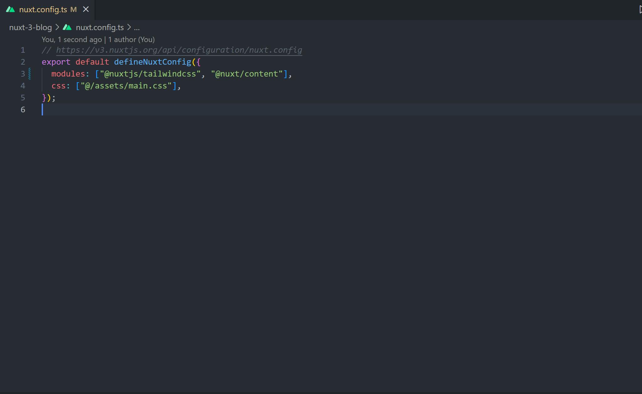
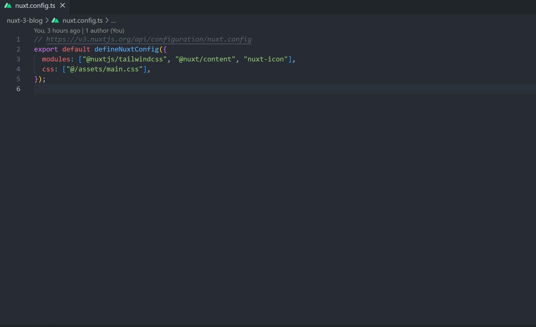
- Head over to your
nuxt.config.tsfile and register yournuxt/contentmodule as shown below:
- Before we get our hands dirty with code, install the
Nuxt Iconmodule in your project by running the following command:
yarn add --dev nuxt-icon
- After the installation process has been completed, navigate to your
nuxt.config.tsfile and register yournuxt-iconmodule as shown below:
- The
Nuxt Iconmodule will be used to display100,000+open source vector icons viaIconify.
Creating the necessary components.
- In your
componentsdirectory, create acontentdirectory. In yourcontentdirectory, create the following files:
List.vue
- In your
List.vuefile, paste the following code:
<script setup lang="ts">
// Utils from Nuxt Content
const { flatUnwrap } = useUnwrap()
defineProps({
    icon: {
        type: String,
        default: 'ph:check-circle-duotone'
    }
})
</script>

<template>
    <ul class="p-0">
        <li v-for="(item, index) of flatUnwrap($slots.default(), ['ul'])" :key="index" class="flex pl-0 space-x-2">
            <Icon :name="icon" class="flex-shrink-0 w-6 h-6 mt-1 text-emerald-500" />
            <span>
                <ContentSlot :use="() => item" unwrap="li" />
            </span>
        </li>
    </ul>
</template>
One of the best features in Nuxt Content is the ability to add Vue components in Markdown by leveraging the
<ContentSlot>component from Nuxt Content.The
Listcomponent will be used to display an icon when writing a list.
Wrong Component
- In your
Wrong.vuefile, paste the following code:
<script setup lang="ts">
// Utils from Nuxt Content
const { flatUnwrap } = useUnwrap()
defineProps({
    icon: {
        type: String,
        default: 'bi:x-octagon'
    }
})
</script>

<template>
    <ul class="p-0">
        <li v-for="(item, index) of flatUnwrap($slots.default(), ['ul'])" :key="index" class="flex space-x-2">
            <Icon :name="icon" class="flex-shrink-0 w-6 h-6 mt-1 text-red-500" />
            <span>
                <ContentSlot :use="() => item" unwrap="li" />
            </span>
        </li>
    </ul>
</template>
The
Wrongcomponent is the same as the List component. It is used to display a X icon when writing a list.In your
componentsdirectory, create the following files:
Navbar.vue
- In your
Navbar.vuefile, paste the following code:
<template>
    <header>
        <nav class="w-full px-3 flex-between h-14 border-b border-gray-800">
            <NuxtLink to="/">
                <div class="flex-center space-x-2">
                    <Icon name="logos:nuxt-icon" class="text-2xl" />
                    <h1 class="text-xl md:text-2xl">Content</h1>
                </div>
            </NuxtLink>

            <div>
                <div>
                    <a href="https://github.com/selemondev" target="_blank">
                        <img src="https://api.iconify.design/carbon:logo-github.svg" alt="Github"
                            class="bg-white rounded-full h-6 w-6">
                    </a>
                </div>
            </div>
        </nav>
    </header>
</template>
- The
Iconcomponent is used to display100,000+open source vector icons viaIconify.
Toc.vue
- In your
Toc.vuefile, paste the following code:
<!-- ./components/Toc.vue -->

<script setup>
// define links prop
defineProps(["links"]);
// flatten TOC links nested arrays to one array
const flattenLinks = (links) => {
    let _links = links
        .map((link) => {
            let _link = [link];
            if (link.children) {
                let flattened = flattenLinks(link.children);
                _link = [link, ...flattened];
            }
            return _link;
        })
        .flat(1);
    return _links;
};
</script>

<template>
    <nav class="bg-gray-900/50">
        <header class="text-white text-center py-2 px-2">
            <h3 class="text-xl font-bold">Table of contents</h3>
        </header>
        <ol class="list-inside list-disc">
            <!-- render each link with depth class -->
            <li v-for="link of flattenLinks(links)" :key="link.id" :class="`toc-link _${link.depth}`">
                <a class="text-gray-200 hover:text-white hover:font-bold" :href="`#${link.id}`">
                    {{ link.text }}
                </a>
            </li>
        </ol>
    </nav>
</template>

<style scoped>
.toc {
    @apply p-4 bg-gray-50 border border-gray-200 rounded-lg;
    @apply max-h-[calc(100vh-6rem)] overflow-auto;
}

.toc-links {
    @apply flex flex-col gap-2 px-2;
}

.toc-link {
    @apply text-slate-500;
}

.toc-link._3 {
    @apply pl-3;
}

.toc-link._4 {
    @apply pl-6;
}

.toc-link._undefined {
    @apply pl-8;
}
</style>
- Toc stands for
Table of content. It is used to display all the tag links for easier content navigation.
Content
- In your
Contentdirectory, create a blog directory and in thatblogdirectory, create anindex.mdfile and paste the following code:
---
title: 'Different Rendering Modes'
description: 'In the modern World, websites are much like applications since we can transact, shop, send messages and do so much more. We have a variety of ways we can use to render a page to a user when the user requests for a page in our web application. In this article, we are going to be looking at the different rendering modes, the advantages and disadvantages of each rendering mode and when to use each one of them.
If that sounds interesting lets get started. Here are the topics we are going to be covering: '
image: "/img/image.jpg"
tags: [NuxtJs,Vue, React, NextJs]
publishedAt: "2022-08-8"
---
## CSR
- CSR stands for Client Side Rendering. It is a technique where all the page resources are loaded on the client's browser rather than on the server.

- CSR is a rendering mode in which the client(browser) sends a request to the web server and the web server responds by sending an empty HTML page with only a reference to your JavaScript bundle and your CSS styles.

- CSR became popular as a method of building Single Page Application as it helped to blur the difference between websites and installed applications.

### How does CSR work
1. Request is sent to the web server by the client.
2. The web server responds by sending back an empty HTML page with only a reference to your JavaScript bundle and your CSS styles.
3. The browser then starts downloading the JavaScript of the page.
4. The browser then executes the JavaScript.
5. The page is now viewable and interactive.

### Advantages of using CSR
::list
- Fast rendering - The page renders quickly after the initial page load time.
- Reduced server workload - Client Side Rendering technologies use the client device's processor to perform the logic thus the processing power is offloaded from the server and transferred down to the client.
- Great with Progressive Web Apps - Client Side Rendered applications work great with PWAs because the code can be entirely rendered on the browser.
- Quicker navigation of the website - CSR offers a quicker navigation because the placeholders are loaded first.
::

### Disadvantages of using CSR
::wrong
- Not good for SEO - SEO stands for Search Engine Optimization. CSR is not good for SEO because it takes time to convert JavaScript to HTML and also because the response gotten from the web server is an empty HTML page with only a reference to a JavaScript bundle and CSS styles.
- Caching issue - Since the HTML is not available in the initial render, browsers cannot cache the HTML structure of the page.One way to avoid this issue is to cache the JavaScript but this may prove to be costly as JavaScript files can take up a lot of space in the browser's memory.
- Slower load time - A client-side rendered application needs to make an additional round-trip to your API server to render. This means your website will always load slower than an equivalent server-side rendered application.
::

### When to use CSR
::list
- When your application has large and dynamic data.
- When your application has a very complex UI with many pages / features.
- When your application has a huge number of users.
::

### Examples of Client-Side Frameworks
1. Vue :icon{ name="logos:vue" }
2. React :icon{ name="vscode-icons:file-type-reactjs" }
3. Angular :icon{ name="vscode-icons:file-type-angular" }
4. Svelte :icon{ name="logos:svelte-icon" }

## SSR
- SSR stands for Server Side Rendering. SSR is a technique where rendering is conducted by the server. It is a rendering mode in which the client sends a request to the web server and instead of the server delivering an empty HTML page, it responds by delivering a fully populated HTML page.

- The server will serve the page on demand every single time meaning the HTML is generated on each request.

### How does SSR work
1. Request is sent to the web server by the client.
2. The browser the connects to the server, which already has the pre-rendered HTML and CSS code for the page.
3. The server then responds by sending back a fully populated HTML page but the page is not yet interactive. The page is viewable but not interactive.
4. The browser then downloads the JavaScript of the page which is readily available on the server.
5. The HTML page is now made interactive through a process known as `Hydration`. `Hydration` is the process of using client-side JavaScript to add application state and interactivity to server-rendered HTML.
6. The browser then executes the JavaScript.
7. The page is now fully loaded and interactive.

### Advantages of using SSR
::list
- Good for SEO - Since Server Side Rendered pages have a faster initial page load time, search engine bots can crawl and index pages very well.
- Amazing User Experience - Since SSR pages have a faster initial page load time, they provide a good user experience.
- No slow internet connection barrier - If a user has a slow internet connection, he/she can view the rendered HTML page while the JavaScript is processing.
- Performance benefit for users and customers.
::

### Disadvantages of using SSR
::wrong
- Server cost - SSR applications often need bigger and powerful servers to provide high performances which often lead to high expenses in acquiring and maintaining the servers.
- Complexity of caching - Configuring your cache is usually complex in Server Side Rendered Applications.
- Slow page transitions - If your pages contain complex data, browsing from page to page is often slow.
::

### When to use SSR
::list
- When you want good SEO performance.
- When you want faster data transmission.
- When you have dynamic content.
::

### Examples of Server Side Frameworks
1. NuxtJs :icon{ name="teenyicons:nuxtjs-outline" class="text-emerald-500"}
2. NextJs :icon{ name="logos:nextjs-icon" class="bg-white rounded-full"}
3. SvelteKit :icon{ name="logos:svelte-icon" }


## SSG
- SSG stands for Static Site Generator. SSG is a tool that generates a full static HTML website based on raw data and a set of templates.
- SSG automates the task of coding individual HTML pages and gets those pages ready to serve users ahead of time.
- In SSG the HTML is generated at build time.

### How SSG works
1. At build time before the content reaches the CDN, a SSG or Framework reads content from the files.
2. The content then gets rendered to HTML based on templates and served to the CDN.
3. The results are then saved in a directory and laid out to match the source files and keep them available when requests to view the contents are made.

### Advantages of using SSG
::list
- Blazingly fast - Statically generated websites are blazingly fast because the content of your website is generated as HTML files ahead of time. When a user comes to your application and requests for a certain page, the server will quickly respond and serve it. It doesn't have to do any processing nor generate any HTML, it just serves it.

- Cheap to host - Hosting a static website is very cheap since there are not many resources to serve in a static website hence the low memory usage and bandwidth which cuts the cost of hosting services.

- Plain and simple - A static website is just a collection of HTML files hosted on a server.

- Host anywhere - You can host your static website on a cloud CDN or anywhere else making your application easier to scale globally and serve data quickly.

- Great SEO performance.
::

### Disadvantages of using SSG
::wrong
- Build time - The biggest disadvantage of SSG is the build time because once the pages are published, the only way to update them is by building the application again which might take some time.

- Steep learning curve - You need some technical and coding knowledge to customize and maintain Static Site Generators.
::

### When to use SSG
::list
- When you have a lot of static content.
- When you want good SEO performance.
- When you want a fast website.
::

### Examples of SSG Frameworks
1. NuxtJs :icon{ name="teenyicons:nuxtjs-outline" class="text-emerald-500"}
2. NextJs :icon{ name="logos:nextjs-icon" class="bg-white rounded-full"}
3. Gridsome :icon{ name="logos:gridsome-icon" }
4. Gatsby :icon{ name="logos:gatsby" }
5. Jekyll :icon{ name="vscode-icons:file-type-jekyll" }

## ISR
- ISR stands for Incremental Static Regeneration. It is a rendering mode that enables developers and content editors to use static generation on a per-page basis without needing to build the entire site.

- With ISR you can retain the benefits of static while scaling to millions of pages.

### Examples of frameworks with ISR capabilities
1. NuxtJs :icon{ name="logos:nuxt-icon"}
2. NextJs :icon{ name="logos:nextjs-icon"}


Thanks for reading :icon{ name="bi:stars" color="yellow"}
Layouts
- In your
layoutsdirectory, create adefault.vuefile and paste the following code:
<template>
    <div>
        <Navbar />
        <slot />
    </div>
</template>
- In our
default.vuefile, the content of the layout will be loaded in the<slot/>, rather than using a special component.
Pages
- In your
pagesdirectory, create the following file:
[...slug].vue
- Navigate into the
[...slug].vuefile and paste the following code:
<script setup>
const { path } = useRoute();
const { data } = useAsyncData(`content-${path}`, async () => queryContent().where({ _path: path }).sort({ publishedAt: -1 }).findOne());
</script>
<template>
    <div class="max-w-2xl px-4 py-10 bg-gray-900 m-auto sm:px-8 sm:shadow sm:rounded">
        <div class="grid-layout" v-if="data">
            <img :src="data.image" :alt="data.title" class="w-96 h-64">
        </div>

        <div class="space-y-6 pb-6">

            <div class="text-center pt-6">
                <h1 class="font-bold text-white text-xl font-Roboto md:text-2xl">{{data.title}}</h1>
            </div>

            <div>
                <p class="text-gray-300">{{data.description}}</p>
            </div>

            <div class="w-full bg-gray-800">
                <Toc :links="data.body.toc.links" />
            </div>
        </div>
        <!-- Fetch and display the Markdown document from current path -->
        <ContentDoc class="prose prose-white prose-invert max-w-none">
            <!-- Slot if document is not found -->
            <template #not-found>
                <h1 class="text-2xl">
                    Page not found
                </h1>
            </template>
        </ContentDoc>
    </div>
</template>
<style lang="postcss">
.prose h1,
h2,
h3,
h4,
h5,
h6 {
    @apply text-white
}

.prose a {
    @apply text-white font-bold no-underline
}

.prose {
    @apply text-gray-300
}
</style>
In our
slug.vuefile, we have useduseAsyncDatato get access to data that resolves asynchronously andqueryContentto build queries with a MongoDB-like syntax.The
<ContentDoc>component is used to render a specific document. In our scenario, we have used the<ContentDoc>component to render a specific document by specifying thepathproperty. We have also written ourproseclass styles on our ContentDoc component and also specified more styles in our style tag.Navigate into your
index.vuefile and paste the following code after clearing the initial code:
<script setup lang="ts">
useHead({
  title: "Nuxt 3 x Blog",
  link: [
    {
      rel: "icon",
      type: "svg",
      href: "https://api.iconify.design/logos:nuxt-icon.svg",
    },
  ],
});
const { data } = await useAsyncData("article", () => queryContent("blog").find());
</script>
<template>
  <div>
    <div class="text-center my-6">
      <h1 class="text-4xl text-gray-400">Latest Article</h1>
    </div>

    <div class="m-6">
      <ul class="flex justify-center items-center flex-wrap">
        <li v-for="article in data" :key="article._path">
          <NuxtLink :to="article._path">
            <div>
              <div class="bg-gray-900 rounded-md w-72 h-[470px] items-center md:h-[490px] md:w-[370px]">
                <div class="px-2 space-y-2">
                  <div class="grid-layout mt-2">
                    <img :src="`${article.image}`" :alt="article.title" class="w-full h-64">
                  </div>

                  <div class="text-center">
                    <h2 class="font-bold text-lg text-white hover:underline md:text-xl">{{article.title}}</h2>
                  </div>
                  <div class="line-clamp-5">
                    <p class="text-sm text-gray-200 line-clamp-3 md:text-lg">{{ article.description }}</p>
                  </div>

                  <div>
                    <span class="text-gray-400 text-sm">Published On: {{ article.publishedAt }}</span>
                  </div>

                  <div>
                    <button class="py-2 px-4 mt-2 bg-gray-700/50 rounded-md">
                      <span
                        class="text-transparent bg-clip-text bg-gradient-to-r from-purple-600 via-sky-400 to-purple-600 background-animate">Read
                        More</span>
                    </button>
                  </div>
                </div>
              </div>
            </div>
          </NuxtLink>
        </li>
      </ul>
    </div>
  </div>
</template>
We have utilised the
useHeadcomposable provided by Nuxt to customize the head properties of our page.We have used
useAsyncDataonce again to fetch the data after the query has been resolved.We have created a new query builder with
queryContent()and gave it a pathblogas a parameter. On the same breathe, we have used thefind()method to resolve the query which will always return an array of one or more items corresponding to documents in thecontent/blogdirectory.
App File
- Finally, navigate into your
app.vuefile and paste the following code :
<template>
  <div>
    <NuxtLayout>
      <NuxtLoadingIndicator />
      <NuxtPage />
    </NuxtLayout>
  </div>
</template>
We have encapsulated the
NuxtLoadingIndicatorandNuxtPagecomponents with theNuxtLayoutcomponent so as to apply our default layout style which we set in thelayoutsdirectory.The
NuxtLoadingIndicatorcomponent displays a progress bar on page navigation.
Conclusion
Nuxt Content V2 has blown me away. The Nuxt team deserves a special recognition for creating such an amazing module.
To understand Nuxt Content even better, you can check out the Nuxt Content Docs to learn even more advanced ways of using it.
As I had promised, here is my Github repository link: github.com/selemondev/Nuxt-Content-Hashnode..
Thank you for taking your time to read my great article and happy coding.